
Show me the variability
At SPSP this year, I sat through some talks that were on questions that were really exciting and interesting. I’m also fortunate to have a regular stream of top-tier researchers coming through my department to present their work. Despite my inherent interest, and the status of the researchers, I often have a really hard time engaging with the content presented at these forums. The reason for this isn’t necessarily because the content is difficult to understand (although sometimes it is), or that the speaker is doing a poor job communicating (although again, sometimes that’s true too). Rather, it’s because I just don’t know what to do with the information I’m being presented because it is fundamentally incomplete.
When you don’t show me some measure of variability, and/or indicate the number of observations you’ve got, I have no idea how to interpret your data. When I have no idea how to interpret your data, I just don’t know what to do with the information you’re trying to communicate to me.
Prevalence of the problem
I looked at all the papers published in JPSP so far this year. JPSP is one of the flagship journals for the field of social psychology. I’d love to be able to point to a paper of my own that was worthy enough to appear there. Unfortunately, I can’t. Regardless, this is supposed to be the best of the best. So far this year, there have been 26 JPSP papers. For each paper, I looked through them for plots in which it would be appropriate to include some visual indicator of variability. Typically this is some kind of bivariate plot that with the means of several groups, or perhaps regression lines. I excluded those figures (frequently occurring) that displayed structural equation models or mediation results. I also excluded plots of proportions (e.g. proportion of the sample that did X). Although, in principle, one can compute standard errors for proportions, and one should include SE in SEM or mediation models, I think I can think of some situations for the former case where excluding them seems more acceptable, and sometimes the SEM and mediation models are so busy that any more numbers would be even more painful to look at than they already inevitably are.
Anyway, 26 papers. Of these 26 papers, 18 had plots that fit my criteria. Of those 18, how many do you think had at least one plot missing a visual display of variability? Think of a number. Unless you’re really cynical, it’s probably not big enough.
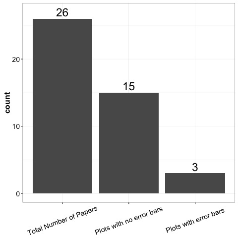
If you guessed 15 (83%), then you can pat yourself on the back. In fact, in this admittedly small sample, there was not a single regression line that indicated any kind of measurement of variance. Not one. This is sufficiently astonishing to me that I’m suspicious that perhaps JPSP doesn’t allow them?
Why is this a problem?
When you talk to me about your research, I want to know about what you’ve done, and I need you to tell me some details so I know how to decide for myself what to think about your evidence. There are a couple of primary reasons why, when there’s no visual indication of variability, I can’t really do this.
-
I may not know the scale of the measurement tool you’re using. Sometimes this is solved by you telling me verbally, but sometimes it isn’t. If I see that one group has a mean of 3, and another group has a mean of 2, that means something much different if it’s a scale that stops at 4, versus one that stops at 40.
-
I’m almost definitely not well acquainted enough with your measurement device to have a good idea of how people vary on it. Is this difference you’re showing me huge, or tiny? It may be statistically significant, but even so, I have no idea how to interpret this in real terms without knowing how much variability there is in how people respond. If you gave people in two conditions a math test, did performance in both conditions range from 0-100%, with the mean higher in one group? Or did people perform closely around the group average in each group? This is important information!
-
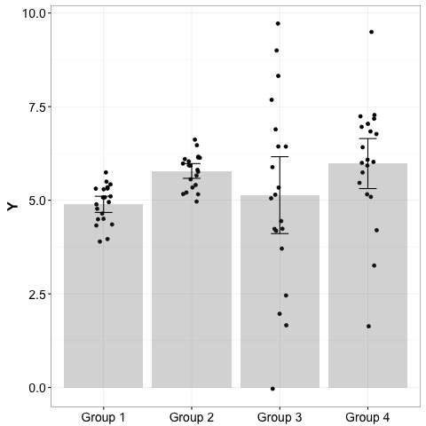
Visual indicators of uncertainty can tell me if your manipulation is shifting the distribution of the effect, or if it’s doing something to the variance, or both. I have no way of distinguishing these. In the plot below, if your manipulation is leading to the difference between group 1 and group 2, that means something much different than if it’s leading from group 1 to group 3 or 4. Ditto for the difference between group 3 and group 4. However, a bar plot without error bars would obscure all of this.
Include sample sizes too
It’s hard to get a handle on how big a problem this is, because I can’t imagine that any journal would let a paper pass without reporting sample sizes. However, it happens with some frequency in talks. This has all the same problems as above - I just can’t interpret what you’re telling me if I don’t know how many observations you’ve got. Even if you display some error bars, it’s hard to know what to do with that information without sample size information. Is the variability you’re showing me because you have a small number of observations, or is it because there’s some inherent variability in your effect?
In summary
I really don’t think I’m being too unreasonable here. There are a lot of interesting phenomena that folks are working on. I’m curious to know about what you’re studying. BUT, I’m also not just going to take your word that whatever effect you’re studying is large or important or meaningful, or not just better characterized as noise. We’ve all been trained to think critically, surely you understand my desire to see properties of your data that could potentially challenge the superficial interpretation one gets from a plain barplot. Am I wrong to find myself tuning out when I can’t interpret someone’s data in the most basic way (i.e. comparing signal to noise)? What do other people do in this situation? Take the speaker at his or her word? Assume that the effect is really as big as they say it is? Should I spend time thinking about some effect, despite not having half of the evidence needed to properly understand it?
I want to make the decision for myself. I want you to show me variability. Even better, if you can, show me the raw data. I know there are occasions where you can’t show raw data. And probably there are occasions where visual indicators of uncertainty are not going to be appropriate. However, if those things exist, they’ve got to be in the minority. There’s no way that in my small sample, 83% of papers with bivariate plots should lack some visual indication of variability.