
Two Variables, One Axis
If it isn’t obvious by now, I’m a big fan of Hadley Wickham’s ggplot2 package for creating visualizations. I’m regularly surprised by how flexible it is, and once you understand what’s going on, how easy it is to specify exactly what you want.
For example, I encountered a situation this week where I wanted to plot two variables on the x axis. When I first started using ggplot, I didn’t have a straightforward way of specifying this. You lay out the aesthetics in the plot background (i.e. what goes on the x axis and what goes on the y axis), and then you start adding layers which show information about those variables that you think are worth highlighting.
So, for example, using the Lahman dataset I’ve previously worked with, we can do something like this:
library(ggplot2)
library(plyr)
library(Lahman)
df.mast <- with(Master, data.frame(playerID=playerID, birth=birthYear))
df<-join(Batting, df.mast)
df$age <- df$yearID - df$birth

ggplot(df, aes(x=age, y=stint)) +
 stat_summary(fun.y=mean, geom='line', color='#144256', size=1.5) +
  theme_bw() + xlab('Age') + ylab('Teams Played for')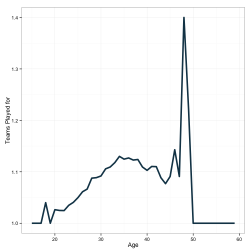
This shows that players tend to see an increased likelihood of being traded as they progress toward their mid 30’s. X axis is age, y axis is the number of teams played for. I’ve made the plot by assigning a plot background:
ggplot(df, aes(x=age, x=stint)) +
And following that up with a layer of data:
stat_summary(fun.y=mean, geom='line', color='#144256', size=1.5)
And then adjusting some of the visual properties:
theme_bw() + xlab('Age') + ylab('Teams Played for').
However, it should be readily apparent that the nature of the plot out at the tails is different than that in the middle. In particular, the pattern is a lot more volatile. This is undoubtedly a function of fewer numbers of observations. There are a few ways to incorporate this information into the plot (show the data!), but to illustrate a neat trick in ggplot, I’m going to write some numbers directly onto the plot. This will require plotting a second variable on one of the axes.
library(dplyr)
df <- count(df, age) %>%
  full_join(df, by='age')

ggplot(df, aes(x=age, y=stint)) +
 stat_summary(fun.y=mean, geom='line', color='#144256', size=1.5) +
  xlab('Age') + ylab('Teams Played for') + theme_bw() +
  geom_point(aes(x=age, y=1, size=df$n), color='#88301B') +
  scale_size_continuous(range=c(1, 10),
                        name='Number of Observations',
                        breaks=c(500, 2500, 4500, 6500, 7500))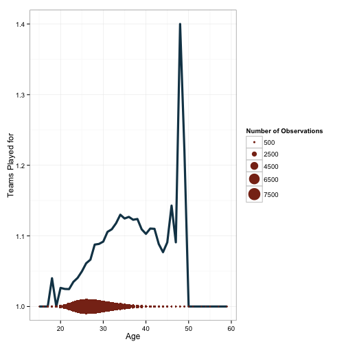
This at least gives an indication. To be clear, this is not how I would typically choose to visualize this data. However, it does give some indication of why we should be hesitant to trust some of the patterns observed out near the ends of the age distribution. Let’s look at how we did that:
ggplot(df, aes(x=age, y=stint)) +
 stat_summary(fun.y=mean, geom='line', color='#144256', size=1.5) +
  xlab('Age') + ylab('Teams Played for') + theme_bw() +
These lines are the same as for the first plot. Next we do something slightly different.
geom_point(aes(x=age, y=1, size=df$n), color='#88301B') +
Here, I’ve added a new layer - geometric points. I’ve also given these points their own data. The x-axis is the same, but I’ve manually specified y to be set to 1 for all values of age. I’m also scaling the size of the point by the variable n, which corresponds to the number of observations at each age bracket. After this, I scale the size of the circles and change the appearance of the legend with the following:
scale_size_continuous(range=c(1, 10),
                      name='Number of Observations',
                      breaks=c(500, 2500, 4500, 6500, 7500))
We can also do something a little stranger, just to illustrate this point a little more thoroughly.
df$scaled.prop <- (df$n/max(df$n)/2)+1

ggplot(df, aes(x=age, y=stint)) +
 stat_summary(fun.y=mean, geom='line', color='#144256', size=1.5) +
  xlab('Age') + ylab('Teams Played for') + theme_bw() +
geom_line(aes(x=age, y=df$scaled.prop), color='#88301B', size=2, linetype=2) 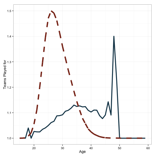
Basically the same plot, but here I’ve included a scaled histogram of the proportion of data which makes up a given age. You can see the calculation:
(df$n/max(df$n)/2_)+1
And then the inclusion on the plot:
geom_line(aes(x=age, y=df$scaled.prop), color='#88301B', size=2, linetype=2)
Finally, let’s include one other kind variable on this plot - the maximum number of trades observed at each age.
df <- df %>%
  group_by(age) %>%
  mutate(age.max=max(stint)) %>%
  ungroup()

ggplot(df, aes(x=age, y=stint)) +
 stat_summary(fun.y=mean, geom='line', color='#144256', size=1.5) +
  xlab('Age') + ylab('Teams Played for') + theme_bw() +
geom_point(aes(x=age, y=age.max), color='#88301B', size=2, linetype=2) 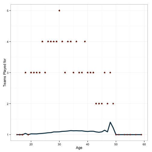
Fascinating. That poor fellow who was traded 5 times in one season! Who is he?
df[df$stint==5,]## Source: local data frame [1 x 29]
##
## age n playerID yearID stint teamID lgID G G_batting AB R H X2B
## 1 30 6681 huelsfr01 1904 5 WS1 AL 84 84 303 21 75 19
## Variables not shown: X3B (int), HR (int), RBI (int), SB (int), CS (int),
## BB (int), SO (int), IBB (int), HBP (int), SH (int), SF (int), GIDP
## (int), G_old (int), birth (int), scaled.prop (dbl), age.max (int)Frank Huelsman, who would be 140 years old today if he were still alive.
And there you have it - I’ve shown a few different instances of plotting different variables on the same axis. Note that this is usually not recommended, as all kinds of problems crop up. You need to account for differences in scaling between your plots, make sure that the reader understands that the two layers represent different variables, and you need to have a good reason for doing it this way. I’d argue that with the first two plots here are not terrible, the third one is atrocious for displaying information, and the last one is okay, but kind of obscures the pattern in the data that we were looking to illustrate.