
Shameless Baseball Love
I play fantasy baseball. In some ways, I’m embarrassed to admit it. I recall being teased for this on more than one occassion when I first started playing these games over 10 years ago. However, I think I’m in good company today. The Fantasy Sports Trade Association (FSTA) has estimated the number of individuals playing fantasy sports in the US and Canada at over 41 million. While I’m not confident that the FSTA is an unbiased party, I think that the figure is in the general ballpark (heh…get it?) of being correct.
Regardless, I’m through defending myself. A couple of weeks ago, I drafted my players for my two teams. In doing so, I spent some time trying to create my own projections for how individual players were going to do. There are a variety of ways to obtain predictions for how individual players will do for the upcoming season. The website Fangraphs includes a handy feature which allows you to download csv files of their projections. They include projections from the ZIPS, and STEAMER projection systems, as well as projections collected from site users who choose to offer up predictions for players.
As Nate Silver famously demonstrated, taking an aggregate of multiple predictions is much better than looking at any individual one. Thus, I attempted to create a projection from a relatively simple combination of these projections.
In some ways, it worked out pretty well. Here are the top pitchers spat out by my system, the index I used to rank them (higher is better) and their predicted stats.
df.pit[1:20,c(1:3, 17:22)]## name position perf.index ip w sv k
## 1 Clayton Kershaw SP 1.972620 220.3333 17.33333 0 245.3333
## 2 Max Scherzer SP 1.917960 209.1000 16.00000 0 241.6667
## 3 Felix Hernandez SP 1.879511 218.7667 15.00000 0 227.0000
## 4 Corey Kluber SP 1.865248 210.7667 15.00000 0 225.3333
## 5 Chris Sale SP 1.857180 203.2333 14.33333 0 228.6667
## 6 David Price SP 1.846916 218.2333 15.33333 0 212.0000
## 7 Madison Bumgarner SP 1.842470 211.3333 15.00000 0 210.3333
## 8 Stephen Strasburg SP 1.836082 197.1000 14.33333 0 220.6667
## 9 Jon Lester SP 1.791945 210.5667 14.33333 0 197.0000
## 10 Johnny Cueto SP 1.753036 196.4333 14.33333 0 179.3333
## 11 Zack Greinke SP 1.752333 195.0000 14.00000 0 183.6667
## 12 Adam Wainwright SP 1.746969 200.9000 15.00000 0 169.3333
## 13 Lance Lynn SP 1.738532 195.2333 14.00000 0 183.6667
## 14 Cole Hamels SP 1.731206 210.6667 11.66667 0 202.6667
## 15 Justin Verlander SP 1.724704 207.4333 14.00000 0 177.0000
## 16 Julio Teheran SP 1.719402 205.3333 13.00000 0 181.0000
## 17 Jordan Zimmermann SP 1.718954 198.4333 14.00000 0 168.3333
## 18 Sonny Gray SP 1.718494 205.3333 13.66667 0 175.3333
## 19 James Shields SP 1.705523 210.2333 12.00000 0 185.6667
## 20 Jeff Samardzija SP 1.702904 204.3333 11.66667 0 196.0000
## era whip
## 1 2.283333 0.970000
## 2 2.896667 1.083333
## 3 2.750000 1.060000
## 4 3.033333 1.113333
## 5 2.850000 1.063333
## 6 3.380000 1.116667
## 7 2.886667 1.086667
## 8 2.996667 1.083333
## 9 3.156667 1.166667
## 10 2.963333 1.120000
## 11 2.990000 1.130000
## 12 3.040000 1.130000
## 13 3.366667 1.253333
## 14 3.270000 1.146667
## 15 3.796667 1.250000
## 16 3.336667 1.160000
## 17 3.116667 1.113333
## 18 3.383333 1.250000
## 19 3.280000 1.160000
## 20 3.726667 1.213333This seems about right. However, to find the top reliever, we need to go way down to number 58.
df.pit[50:60, c(1:3, 17:22)]## name position perf.index ip w sv k
## 50 Drew Hutchison SP 1.579147 168.76667 11.333333 0 161.6667
## 51 C.J. Wilson SP 1.573079 181.00000 11.666667 0 153.6667
## 52 Garrett Richards SP 1.571209 164.00000 11.333333 0 151.3333
## 53 Wily Peralta SP 1.570263 185.76667 11.666667 0 149.3333
## 54 Doug Fister SP 1.555146 183.76667 12.333333 0 130.0000
## 55 Shelby Miller SP 1.554679 177.33333 10.333333 0 158.3333
## 56 Yovani Gallardo SP 1.546164 189.00000 11.000000 0 147.6667
## 57 Anibal Sanchez SP 1.542683 160.33333 11.333333 0 144.0000
## 58 Aroldis Chapman RP 1.540019 63.66667 4.333333 36 107.0000
## 59 Trevor Bauer SP 1.539723 176.90000 9.666667 0 168.0000
## 60 Derek Holland SP 1.533311 174.76667 10.666667 0 147.3333
## era whip
## 50 4.086667 1.2600000
## 51 4.100000 1.3800000
## 52 3.233333 1.1966667
## 53 3.990000 1.3466667
## 54 3.353333 1.1933333
## 55 3.720000 1.2600000
## 56 4.143333 1.3333333
## 57 3.496667 1.1933333
## 58 1.863333 0.9466667
## 59 4.170000 1.3500000
## 60 3.833333 1.2533333How did this happen? Well, first let me say what the ranking logic is:
\[PI = Z_{log(win)} + Z_{save} + Z_{log(k)} + Z_{w.era} + Z_{w.whip}\]Where $PI$ is the performance index, and each term represents the standardized value of the average prediction from each projection system. $w.era$ and $w.whip$ are weighted by the ratio of $predicted innings/\mu_{predicted innings}$.
I should say that after the above calculations, I also standardized $PI$.
Just to illustrate the problem a bit better, here’s the distribution for the two pitcher types:
library(ggplot2)
ggplot(df.pit, aes(x=perf.index, fill = position, group = position)) +
  geom_density(alpha = .5) +
  scale_fill_manual(values = c('#144256', '#88301B')) +
  theme_bw()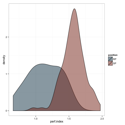
We can do the same for all the values which make up the index:
library(ggplot2)
ggplot(df.pit, aes(x=std.w, fill = position, group = position)) +
  geom_density(alpha = .5) +
  scale_fill_manual(values = c('#144256', '#88301B')) +
  theme_bw() +
  ggtitle('Wins')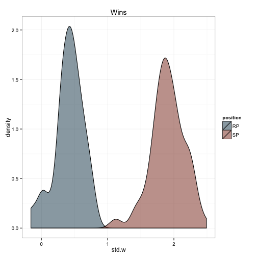
ggplot(df.pit, aes(x=std.sv, fill = position, group = position)) +
  geom_density(alpha = .5) +
  scale_fill_manual(values = c('#144256', '#88301B')) +
  theme_bw() +
  ggtitle('Saves')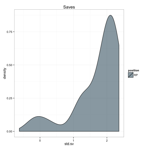
ggplot(df.pit, aes(x=std.k, fill = position, group = position)) +
  geom_density(alpha = .5) +
  scale_fill_manual(values = c('#144256', '#88301B')) +
  theme_bw() +
  ggtitle('Strikeouts')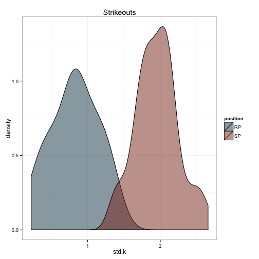
ggplot(df.pit, aes(x=std.w.era, fill = position, group = position)) +
  geom_density(alpha = .5) +
  scale_fill_manual(values = c('#144256', '#88301B')) +
  theme_bw() +
  ggtitle('Weighted ERA')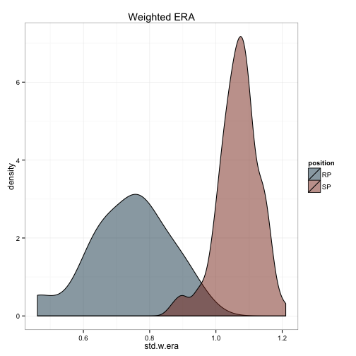
ggplot(df.pit, aes(x=std.w.whip, fill = position, group = position)) +
  geom_density(alpha = .5) +
  scale_fill_manual(values = c('#144256', '#88301B')) +
  theme_bw() +
  ggtitle('Weighted WHIP')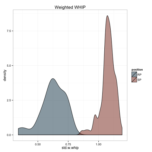
The first thing that struck me is that the ERA and WHIP calculations aren’t distributed as I would expect. I would certainly expect relievers to have a lower era and whip in general, but the distributions there almost don’t overlap at all. This suggests that my weighting formula needs some tweaking. I’ll present what I did next time.