
n-1
A colleague of mine conducting a meta analysis recently asked me if it was possible to combine the standard deviations of two separate samples if you know the mean, standard deviation, and number of observations from each group on its own. I thought it probably was, but couldn’t be sure. Eventually, he pointed me here, which suggests that all one needs to do is sum the weighted sample standard deviations, to which you add the weighted squared differences between each mean and the combined mean. That quantity is divided by the sum of the two sample sizes and square rooted.
Or, more succinctly:
\[\sigma = \sqrt{\frac{n_1 \sigma_1^2 + n_2 \sigma_2^2 + n_1(\mu_1 - \mu)^2 + n_2(\mu_2 - \mu)^2}{n_1 + n_2}}\]This looked okay to me, except for one thing: dividing by \(n\) leads to underestimating the true standard deviation. Thus we typically divide by \(n - 1\). To demonstrate this, I’ve simulated drawing 10,000 random samples of n = 30 from a normal distribution with M = 100, S = 10 and plotted the results below:
library(ggplot2)
library(reshape2)
set.seed(42)

numsamples <- 10000
mean <- 100
sd <- 10
n <- 30

simulation <- function(mean, sd, n, numsamples) {
  samples <- data.frame(uncorrected=rep(0, numsamples),
                        corrected=rep(0, numsamples))

  for (i in 1:numsamples) {
    sample = rnorm(n, mean, sd)
    samples$uncorrected[i] = sqrt((1/n * sum((sample-mean(sample))^2)))
    samples$corrected[i] = sqrt((1/(n-1)) * sum((sample-mean(sample))^2))
  }

  return(samples)
}

samples<-simulation(mean, sd, n, numsamples)
samples<-melt(samples)
names(samples) <- c('calculation', 'standard_deviation')
plot <- ggplot(samples, aes(samples$calculation, samples$standard_deviation))
plot + geom_boxplot() +
  ylab('Standard Deviation') + xlab('Calculation Method')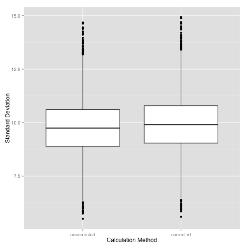
Notice that even the corrected value underestimates a little bit, but the bias is not as large as that for the uncorrected calculation.
We can also examine how this changes as a function of sample size. I’ve repeated the simulation with sample sizes of 10, 25, 50, and 100.
iter <- c(10, 25, 50, 100)
runs <- data.frame(uncorrected=rep(0, numsamples*length(iter)),
                 corrected=rep(0, numsamples*length(iter)),
                 sample_size = rep(factor(iter), each=numsamples))

for (i in 1:length(iter)) {
  samples <- simulation(mean, sd, iter[i], numsamples)
  runs$uncorrected[runs$sample_size == iter[i]]<-samples$uncorrected
  runs$corrected[runs$sample_size==iter[i]]<-samples$corrected
}

runs<-melt(runs, id.vars = 'sample_size')
names(runs)[c(2,3)] <- c('calculation', 'standard_deviation')

plot <- ggplot(runs, aes(runs$sample_size, runs$standard_deviation,
                         fill=calculation))
plot + geom_boxplot() +
  ylab('Standard Deviation') + xlab('Sample Size')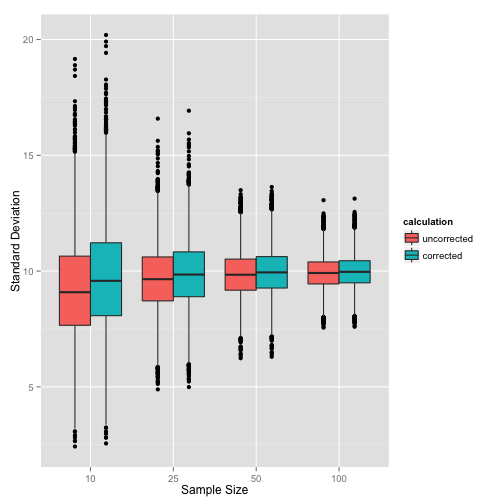
This clearly shows that as we increase the sample size, the bias in the uncorrected calculation method is less pronounced, and the difference between the two calculations becomes smaller.
Next time, we will examine how this works in the context of pooling two reported standard deviations.