
On the Importance of Looking at your Data
I’ve long been meaning to mess around with the Lahman database. Baseball season is right around the corner (sort of), and I thought now would be a good time to look at what I can do with this. In the process of poking around, I realized that I had encountered a very important lesson on looking at your data. I mean looking at it. Making plots, tables, and so forth. I haven’t done any real analyses of these data yet, but it seemed like a good time to post what I’ve done.
I thought I’d look at how runs scored change over time - both historically and over the course of an individual player’s career. So I’m going to start by pulling playerID, team, year, and runs from the Batting table within the Lahman database. I’ll also get playerID and year of birth from the Master table within Lahman.
library(Lahman)

df.bat <- with(Batting, data.frame(playerID=playerID,
                               teamID=teamID,
                               yearID=yearID,
                               R=R
                               ))
But if I’m going to predict runs scored, I also need information about how old the player was - age is a crucial predictor of performance. Conventional wisdom suggests that player performance peaks in the late twenties to early thirties, and declines pretty rapidly after that. Raw age is not available, so I’ll have to compute it.
df.mast <- with(Master, data.frame(playerID=playerID,
                                   birth=birthYear))

df <- merge(df.bat, df.mast, by='playerID')
df$age <- df$yearID - df$birth

library(ggplot2)

ggplot(df, aes(x=age)) +
  geom_histogram(binwidth=1, fill="#144256") +
    ylab('Count') + xlab('Age') +
  theme_bw()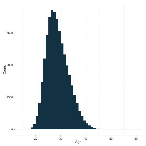
That looks about as expected. Let’s take a look at the distribution of runs scored:
ggplot(df, aes(x=R)) +
  geom_histogram(binwidth=1, fill="#144256") +
    ylab('Count') + xlab('Runs') +
  theme_bw()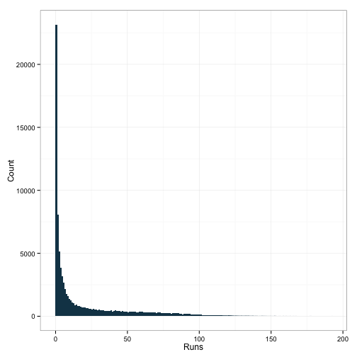
Okay, also, not surprising. Most of the observations in this dataset probably come from players who had a cup of coffee and that was it. I’m not really interested in these individuals, so I think we’ll limit our sample to players who had a bit more experience. We’ll use at-bats as a proxy for this, so I’ll need to bring that into the dataframe.
df$AB <- Batting$AB

ggplot(df, aes(x=AB)) +
  geom_histogram(binwidth=1, fill="#144256") +
    ylab('Count') + xlab('At-bats') +
  theme_bw()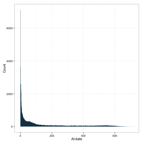
Looks like another poisson distribution. However, it also looks like we can see a bump out at around 550 or so. Let’s zoom in on those, just to gratify my curiosity.
ggplot(df[df$AB>250,], aes(x=AB)) +
  geom_histogram(binwidth=1, fill="#144256") +
    ylab('Count') + xlab('At-bats') +
  theme_bw()
uh huh. Looks like we’ve got a mixture of distributions here. I’m not really sure how to handle this. I wonder what happens if I look at the number of games played too.
df$G <- Batting$G

ggplot(df, aes(x=G)) +
  geom_histogram(binwidth=1, fill="#144256") +
    ylab('Count') + xlab('Games') +
  theme_bw()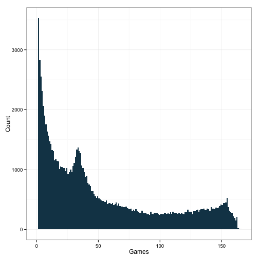
Okay, there’s some other odd stuff going on here. I’m not sure what that bump at around 40 is. Anyone else? Regardless, we’re seeing the same kind of bump out near the end. The corresponding bump in AB should represent players who basically played a full season. Let’s see what happens to the AB distribution if we select players who had more than 150 games.
ggplot(df[df$G>150,], aes(x=AB)) +
  geom_histogram(binwidth=1, fill="#144256") +
    ylab('Count') + xlab('At-bats') +
  theme_bw()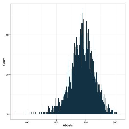
Oh man, look at that distribution! I suppose I could cut off some of those lower values, but I think this looks pretty nice! Now, let’s look at runs scored.
ggplot(df[df$G>150,], aes(x=R)) +
  geom_histogram(binwidth=1, fill="#144256") +
    ylab('Count') + xlab('Runs') +
  theme_bw()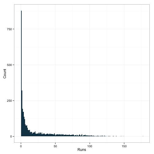
Mystifying. How could someone play 150 games without scoring a single run? Let’s take a look at a few observations.
head(df[which(df$G>150 & df$R < 10),])## playerID teamID yearID R birth age AB G
## 208 abreubo01 HOU 1996 1 1974 22 576 154
## 281 ackerto01 CIN 1957 1 1930 27 607 153
## 381 adamsbo04 DET 1977 2 1952 25 584 151
## 478 adamswi01 PTF 1914 1 1890 24 590 157
## 569 agbaybe01 BOS 2002 5 1971 31 636 153
## 656 aguirha01 DET 1959 0 1931 28 543 151Row 569 belongs to a player named Benny Agbayani, who played for the Red Sox in 2002 (as well as the Rockies). Baseball-reference tells me that he played in 61 games, had a total of 154 ABs that year, and scored a total of 15 runs. So clearly this data isn’t right. Let’s look at the the original dataframe to be sure I didn’t do something wrong when I extracted this.
Batting[which(Batting$playerID=='agbaybe01'),]## playerID yearID stint teamID lgID G G_batting AB R H X2B X3B HR
## 555 agbaybe01 1998 1 NYN NL 11 11 15 1 2 0 0 0
## 556 agbaybe01 1999 1 NYN NL 101 101 276 42 79 18 3 14
## 557 agbaybe01 2000 1 NYN NL 119 119 350 59 101 20 1 15
## 558 agbaybe01 2001 1 NYN NL 91 91 296 28 82 14 2 6
## 559 agbaybe01 2002 1 COL NL 48 48 117 10 24 5 0 4
## 560 agbaybe01 2002 2 BOS AL 13 13 37 5 11 1 0 0
## RBI SB CS BB SO IBB HBP SH SF GIDP G_old
## 555 0 0 2 1 5 0 0 0 0 1 11
## 556 42 6 4 32 60 4 3 0 3 8 101
## 557 60 5 5 54 68 2 7 0 3 6 119
## 558 27 4 5 36 73 0 5 1 1 11 91
## 559 19 1 0 10 35 0 0 0 1 4 48
## 560 8 0 0 6 5 1 0 0 0 1 13That confirms it. I’ve goofed somewhere. Let’s track this down.
df.bat <- with(Batting, data.frame(playerID=playerID,
                               teamID=teamID,
                               yearID=yearID,
                               R=R
                               ))
df.bat[which(df.bat$playerID=='agbaybe01'),]
## playerID teamID yearID R
## 555 agbaybe01 NYN 1998 1
## 556 agbaybe01 NYN 1999 42
## 557 agbaybe01 NYN 2000 59
## 558 agbaybe01 NYN 2001 28
## 559 agbaybe01 COL 2002 10
## 560 agbaybe01 BOS 2002 5That’s fine. Next thing I did was:
df.mast <- with(Master, data.frame(playerID=playerID,
                                   birth=birthYear))

df.mast[which(df.mast$playerID=='agbaybe01'),]
## playerID birth
## 110 agbaybe01 1971Next:
df <- merge(df.bat, df.mast, by='playerID')

df[which(df$playerID=='agbaybe01'),]
## playerID teamID yearID R birth
## 565 agbaybe01 NYN 2001 28 1971
## 566 agbaybe01 NYN 1999 42 1971
## 567 agbaybe01 NYN 2000 59 1971
## 568 agbaybe01 NYN 1998 1 1971
## 569 agbaybe01 BOS 2002 5 1971
## 570 agbaybe01 COL 2002 10 1971AH! That worked okay, but for some reason, the values rows have been shuffled around a little bit. Whereas before, the dataframe was organized alphabetically by player ID, and chronologically by year within player, now the years have been shuffled. I can’t really see any logic to the ordering within player. Maybe reverse chronologically? Regardless, this is an easy fix. I’ll go ahead and recompute the age, and then extract ABs and games played in a way which will assign the values correctly. To do this, I’m going to use Hadley Wickham’s plyr package.
df$age <- df$yearID - df$birth
library(plyr)
df<-join(Batting, df)
## Joining by: playerID, yearID, teamID, Rdf[which(df$playerID=='agbaybe01'),]## playerID yearID stint teamID lgID G G_batting AB R H X2B X3B HR
## 555 agbaybe01 1998 1 NYN NL 11 11 15 1 2 0 0 0
## 556 agbaybe01 1999 1 NYN NL 101 101 276 42 79 18 3 14
## 557 agbaybe01 2000 1 NYN NL 119 119 350 59 101 20 1 15
## 558 agbaybe01 2001 1 NYN NL 91 91 296 28 82 14 2 6
## 559 agbaybe01 2002 1 COL NL 48 48 117 10 24 5 0 4
## 560 agbaybe01 2002 2 BOS AL 13 13 37 5 11 1 0 0
## RBI SB CS BB SO IBB HBP SH SF GIDP G_old birth age
## 555 0 0 2 1 5 0 0 0 0 1 11 1971 27
## 556 42 6 4 32 60 4 3 0 3 8 101 1971 28
## 557 60 5 5 54 68 2 7 0 3 6 119 1971 29
## 558 27 4 5 36 73 0 5 1 1 11 91 1971 30
## 559 19 1 0 10 35 0 0 0 1 4 48 1971 31
## 560 8 0 0 6 5 1 0 0 0 1 13 1971 31Okay. Mucho mejor! Let’s re-examine those distributions which had looked so good before. This is the bump in ABs.
ggplot(df[df$AB>250,], aes(x=AB)) +
  geom_histogram(binwidth=1, fill="#144256") +
    ylab('Count') + xlab('At-bats') +
  theme_bw()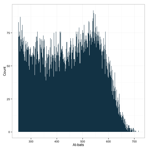
Not too much of a difference, but it is slightly different. Next, limit the data to only those with more than 150 games played:
ggplot(df[df$G>150,], aes(x=AB)) +
  geom_histogram(binwidth=1, fill="#144256") +
    ylab('Count') + xlab('At-bats') +
  theme_bw()
Nice! That even might be slightly more symmetric than the original one. Alright, let’s look at the runs scored for this group.
ggplot(df[df$G>150,], aes(x=R)) +
  geom_histogram(binwidth=1, fill="#144256") +
    ylab('Count') + xlab('Runs') +
  theme_bw()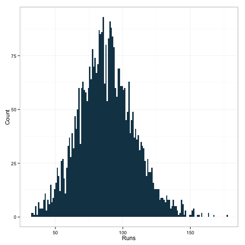
Man that’s gratifying. Look at that distribution. Just look at it! And this leaves us with a good bit of data too, weighing in with 3914 observations. I’d also made a shiny plot here, but I decided that I was spending too much time trying to find some way to get it to display anywhere other than on my local machine. If you really want, run all the code I’ve pasted above, plus the stuff down below here and you can see a nice histogram of runs scored, given some minimal qualifier of games played, from 1 to 162.
library(shiny)
inputPanel(
  sliderInput('games', label="Minimum Number of Games Played:",
              min=1, max=162, value=150, step=1)
  )

renderPlot({
     p<-ggplot(df[df$G>input$games,], aes(x=R)) +
    geom_histogram(binwidth=1, fill="#144256") +
    ylab('Count') + xlab('Runs') +
    theme_bw()
   print(p)
})
So, what’s the lesson here? Just to make sure you’re looking at your data. At every step of the way. You never know when you’ll have done something you didn’t intend to, or when some variable looks much different from the way you think it should. In the former case, you’ll need to retrace your steps to find the problem. In the latter case, you may have to rethink your analyses.